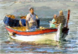
Bread and beer vendor in Turkey. I am trying to capture an old world feel here. Fiddling with some new techniques

Track my ART works and interact with an ART experience. Paki explores a variety of media to find a more complete expression. SAY IT WITH PAINT. ACRYLIC, OIL, PASTEL, PENCIL, WATERCOLOR, DIGITAL.
5 comments:
Jerry, I've seen your art improving steadily over a short time. Your portrait of the little girl in Maria's recent challenge is a good example of your hard work and play paying off. It is strikingly beautiful and your style is finding its way.
This piece too has the potential to be a stunner. I feel the background, though distant, is still a bit under-developed. I will be interesting to see what you do in that area. Nice work.
__________________
Joel
I have nothing to say except, FANTASTIC JOB...and I love it
Aggie
Jerry...I love this...it reminds me so much of Greece (same part of the world as Turkey). Lovely feel and has really captured the quality of light in that part of the world... I would be proud of this...however...because you asked...I am going to be nit picky, but remeber...this is nit picking...you could add these nits up, multipy them by 100 and you'd still have a fine painting. Right...I've disclaimed enough.
First pick...the water line at the bow is a little confusing to me. It doesn't quite seem to follow the hull. Mostly I think it's down to the mark that looks like a "Z". This looks like it represents a ripple but a ripple wouldn't be there I don't think.
Pick Number 2...The red band across the top of the boat darkens a little too much to the left of the tiller. It looks too much like a thick black line.
Pick 3....the blue box with the loaves on it is unclear...I can make it out mainly because of the title, but it also reads a bit like 3 guys in blue jackets and yellow hats, sitting in a line, hugging their knees and having a snooze in the sun.
And I have to agree with Joel about the background being a little under developed.
Remember tho, all of this is just my opinion here tonight and because I was deliberatly looking for fault. I still think it's a lovely painting.
Dave - Rimbauds Shop
I think that this is a nice piece of work, too. Looking forward to the completed painting.
digistyle
its a nice pic as it is, but if something is niggling you it may be the composition. I think the dark blue things(sorry not sure what they are) on the far end of the boat are too dark and maybe a little too near the edge of the painting. just toning them down might help.
also the background. maybe keep those colours but use the technique in the distance that you used on the foreground. maybe a bit softer but see how it looks.
gav
Post a Comment